K
Finding the right amount of colour for a subject is not always easy, especially if the subject’s tonal value is very strong in many areas. Due to the description in the chapters about paper and printing, the paper pigment tends to “close up” sometime while printing, meaning it will not accept colour anymore. This can lead to areas of the printed sheet having spotty, frayed puddles of colour, which above all develop because the colour does not know where to sink in. Any available pigment is used up, so the colour remains on the substrate.
Despite or rather because of the use of colour profiles, different kinds of ink coverage should definitely be tested. Additionally, gradation curves should be adjusted before gamut mapping. Experimenting with different scannings or even grainy ink coverage is advisable as well. Especially with dark colours, lower ink coverage can be an advantage, whereas bright colours can usually stand a higher ink coverage. Within the operating system of the risograph, the “save ink” function should not be neglected: it can sometimes help making the print image more uniform, and it is also possible to counteract the effect of a print image that was printed too dark by using the colour intensity setting on the risograph control panel.
If all these attempts do not lead to the desired goal, you’ll have to prepare another master. Before making adjustments to the source file, it is worth trying to explore the settings of the printer software within the operating system — it contains options for brightening or reducing contrast as well. The most noticeable printing restriction is excessive ink coverage, especially when the ink coverage appears in the corners of books or magazines and soils the pages when they’re touched or turned.
 1
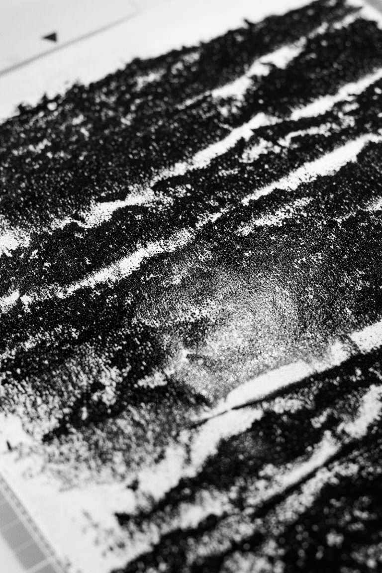
Abrasion of a master on a sheet of transparent paper. Even after the duration of five months, the ink is still wet on the sheet and leaves strong traces upon contact
1
Abrasion of a master on a sheet of transparent paper. Even after the duration of five months, the ink is still wet on the sheet and leaves strong traces upon contact
 1
1
 2
2
