F
It is very important that the letters are real text or at least vectors if you want to depict writing in good quality. This is because the risographs internal RIP then recognises it as text, prompting it to not screen it. Embedding writing as a graphic should only be done when reproducing a text that has already been printed, such as an original manuscript (e.g. with handwritten notes), if the writing is distorted artistically so the resulting lower, pixelated or fuzzy image quality is negligible or if doing so serves an artistic purpose.
In order to display reading typography as well as possible, font sizes for sans serif fonts should not go below 7 pt, for serif fonts, font sizes over 8 pt are recommended. It is imperative that long texts passages are created with 100% colour so they do not get rasterized.
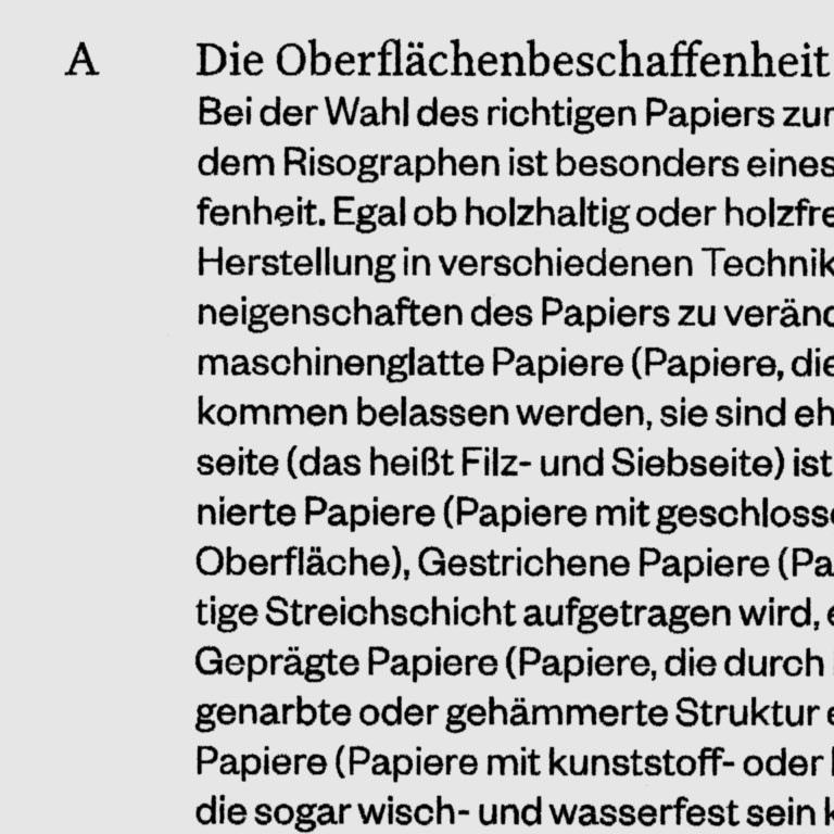 1
Text section printed on the risograph in 100% black colour
1
Text section printed on the risograph in 100% black colour
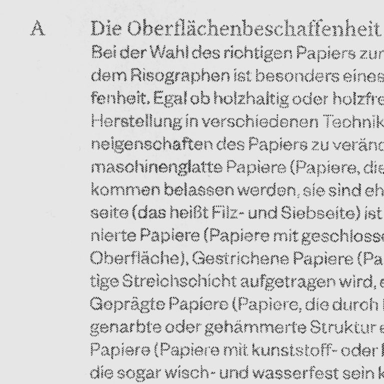 2
Text section printed on the risograph in 100% colour, but not converted with a colour field and thus separated by the risograph
2
Text section printed on the risograph in 100% colour, but not converted with a colour field and thus separated by the risograph
