E
Due to its weak internal raster image processor (RIP), the risograph does not properly rasterise transitions with 0–5% ink coverage, which results in images in those areas ripping and simply being rendered white. This can be remedied by:
adding a slight shade of grey behind photographs, or:
creating a gradation curve, which at 90% cuts off the highlights of colours with 90 – 100% ink coverage.
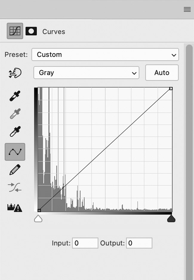 1
Unedited curve in Adobe Photoshop with a tonal range of 100%
1
Unedited curve in Adobe Photoshop with a tonal range of 100%
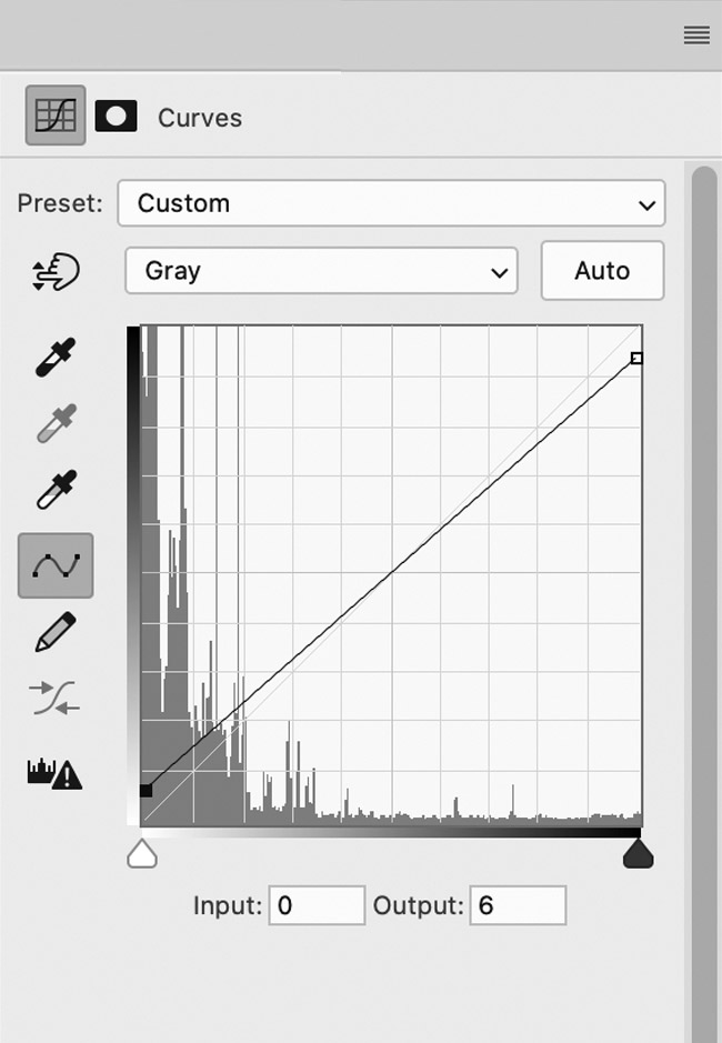 2
Adapted curve with a tonal range of about 90%, resulting in a better printable motif
2
Adapted curve with a tonal range of about 90%, resulting in a better printable motif
The gradation curve is an extensive tool for correcting all aspects of the tonal values of various images. The tonal values are displayed as
a straight diagonal line within a diagram. Depending on the colour mode, this diagram displays input and output values for the various colours of an image on the x or y axis. The dialogue of the gradation curves can be displayed either via Image > Adjustments > Curves or via the adjustment level symbol at the bottom of the layer palette, in case you want to make changes to the gradation curve afterwards using an adjustment level. That way, the original image remains untouched. In the background of the dialogue, the histogram of the image shines through. It represents the distribution of colour tones of the image in graphical form. The gradation curve itself is above the histogram and shows the input and output values of the image in a linear curve, at least if there was no processing done. If the image is already in greyscale mode, the tonal values close to the zero point of the graph are also approaching zero, so the lowest point represents the brightest spots of the image. This is contrasted by the image’s darkest tones being furthest away from the lowest point. So in each case, the scale adapts to the ink coverage of the image. The input values are on the horizontal axis and the output values on the vertical one. If control points are added to the line and they are moved, the shape of the gradation curve changes. This alters the tonal values of the image. The dialogue itself contains two toolbars, one of which is placed vertically on the left side of the field, and the second one being at the bottom of the checkbox. In order to reach usable results and to prepare the image for the risograph, two simple methods of image processing can be pursued. In the left toolbar, for example, is the On-image-adjustment tool, represented by the finger icon with two vertically aligned arrows. This can be used to move the cursor to the brightest part of the image. That part is now indicated on the gradation curve and can be darkened by clicking and dragging it downwards with the cursor so the curve is approximately 5% flatter. For checking purposes, the values for input and output can be reviewed.
If an adjustment has been made to the image, these fields now show two different values. The same procedure can be done with the shadows of the image as well. These should be brightened up a little to decrease the amount of ink coverage on the substrate. By clicking on a particularly dark part of the image with a lot of ink coverage and a pushing the cursor upwards, that point will then be brightened up by the desired amount. Again, it is advisable to only process it by 5%.
