F
Applying ink to a substrate in risography involves autotypical colour synthesis, a combination of additive and subtractive colour mixing. Colour dots in the print are printed side by side in a periodic raster so they partially overlap and are partly printed on white ground. On the one hand, this results in additive colour mixing, because the dots are so small that they can no longer be perceived as such and therefore blur. On the other hand, it is a subtractive colour mixing; when the dots overlap, two coloured dots can create further colour impressions. Similar to offset, flexographic or screen printing, the thickness of the applied coating on the substrate does not vary based on the setting of the printing speed. Colour is either transferred or not transferred to a certain point.
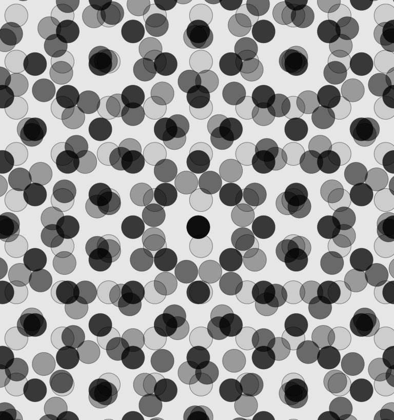
Intermediate stages and continuous transitions, as in the photographic halftone image, are not possible and are therefore simulated by halftone dots. When superimposing these fine rasters, interferences can occur, which are manifested in the emergence of another raster structure, the so-called moiré effect. The points of the individual rasters are arranged in such a way that the overlapping creates rosette-like patterns in the image.
 1
Schematic representation of the moiré effect; two point patterns of equal pitch are superimposed and twisted against each other
 2
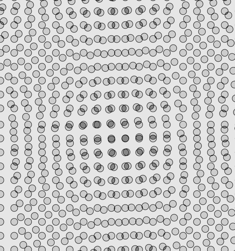
Large magnification of an offset rosette; in principle, this one is also a moiré. Since the repetition rate of the points is so low, however, this is not negatively noticeable
 1
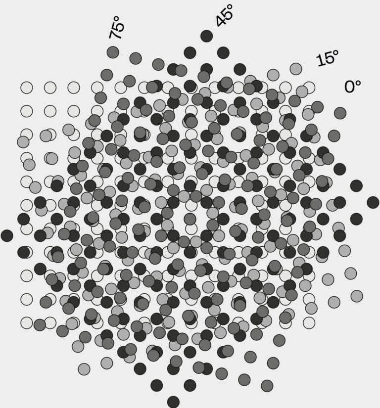
Screen angles for four-colour printing, the darkest colour requires 45 °, the second darkest 75 °, the second brightest 15 ° and the brightest colour 0 °
 2
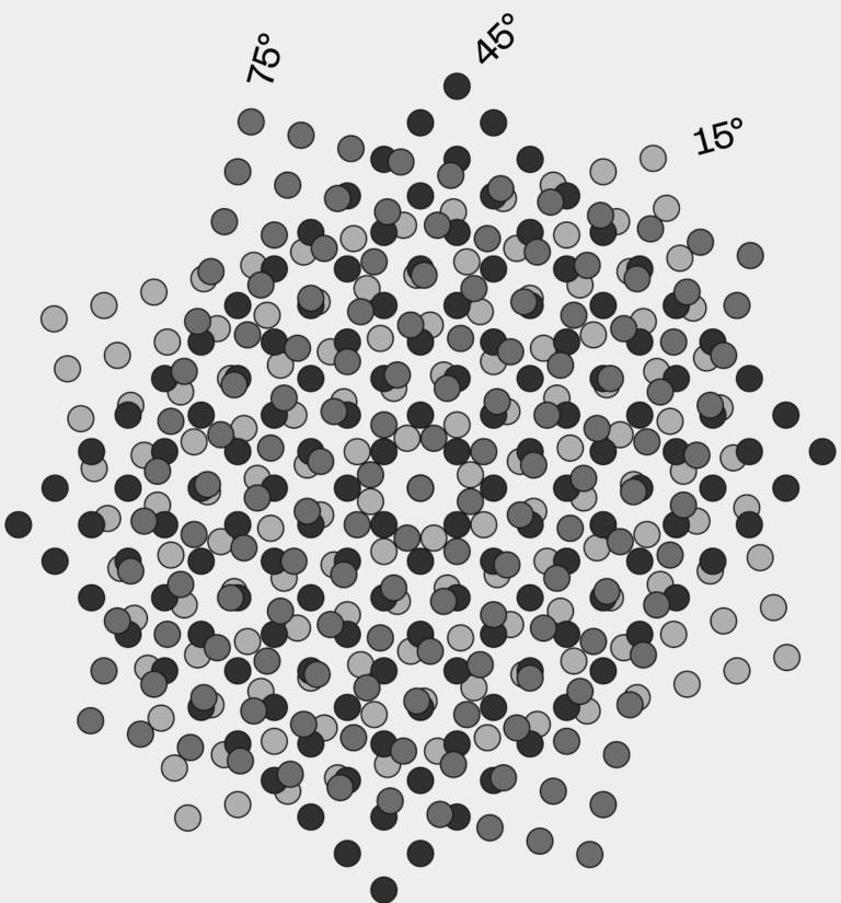
Screen angles for three-colour printing with the darkest colour requiring 45°, the medium colour 75° and the brightest colour requiring 15° angulation
 3
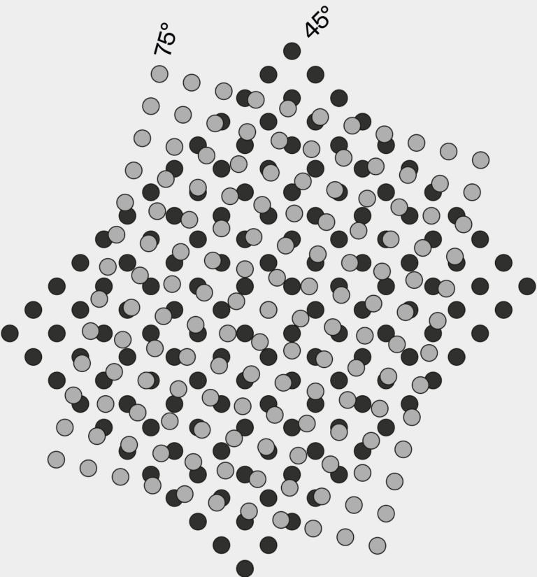
Screen angles for two-colour printing; in this case the darker colour requires an angle of 75°, the lighter colour requires 45 °
To avoid this effect, either the frequency of the raster must be changed or the screen angles of the colour separations must be manipulated. For four-colour printing, modern print companies provide the following model of primary colours of subtractive colour mixing.
Yellow, the most inconspicuous colour, is given the worst-case angle (0 °) to highlight it. Black, on the other hand, is the colour richest in contrast and is assigned the steepest screen angle (45 °). Cyan and Magenta are now placed as far away as possible from black and rounded to 15 ° and 75 °, whereas cyan, like yellow, gets a rather harmless angle to avoid the aforementioned moiré effect . The result achieved by these angles is that the less visible colours are not drowned out by the stronger colours. If the screen angle is not adjusted for four colours, the first thing to cross out is the value that is most salient to the viewer (0 ° for the yellow colour separation) and the colours are arranged in the order of the brightest, medium and darkest colour intensity. Bright colours are again rasterised at a more harmless angle and the darker colours are rasterised at an angle as far away as possible.
An example:
A coloured subject in the colour separations red, yellow and blue is to be reproduced in three print runs, i.e. once in two colours and once in a single colour on the risograph. In that case, yellow as the brightest colour would have to be rasterised at 15 °, red as the middle colour at 75 ° and blue, the darkest colour, at 45 °. If only two colours were rasterised, the angle of the brightest colour would be dropped, and the screening process would be limited to 45 ° and 75 °. The angle of 45 ° applies to the darker colour, 75 ° to the brighter colour. 10 It does not matter which colours are printed with, as colours are always ordered by brightness, and that order should strictly be adhered to. For information about the order of colours in print, see point I (Colour order). If only one colour is reproduced, it will only be rasterised at 45 °, since monochromatic reproduction is a matter of preventing the screen angles from building up lines.
 1
1
 2
2
 1
1
 2
2

